
All categories
Lead Generation_
High-Converting Lead Magnet Landing Page: Tips & Examples
Proven Strategies and Inspiring Examples for Creating Effective Lead Magnet Landing Pages

Co-founder & CEO Onilab
·
Jun 27, 2024

Lead Generation_
High-Converting Lead Magnet Landing Page: Tips & Examples
Proven Strategies and Inspiring Examples for Creating Effective Lead Magnet Landing Pages
Co-founder & CEO Onilab
·
Jun 27, 2024
Lead Generation_
High-Converting Lead Magnet Landing Page: Tips & Examples
Proven Strategies and Inspiring Examples for Creating Effective Lead Magnet Landing Pages
Co-founder & CEO Onilab
·
Jun 27, 2024
Would you share personal contact details on any website you land on? Most likely, you answer "No". That's why you shouldn't expect visitors to do it on your website, either.
To encourage people to engage with your brand and initiate potentially long-standing relationships, you need something valuable in return. Why not try a lead magnet?
Lead magnets are pivotal tools in digital marketing. They offer potential customers knowledge in the form of a free eBook, white papers, webinars, interactive calculators, and so on. However, a valuable lead magnet requires a dedicated place to be visible to the target audience. That's where the need for a lead magnet landing page emerges.
In this article, we'll teach you how to organize such a page and create visually appealing and effective lead magnets. To illustrate our main ideas, we'll share real-life examples of lead magnet landing pages.
Lead Magnets: What Are They and Why Do We Need Them?
A lead magnet is a type of marketing tool that solicits contact information from website visitors in exchange for a long-form document (e.g., a cheat sheet, checklist, PDF), free consultations, personal finance coaching calls, a discount code, etc. It acts as an incentive because traffic won't transform into paid leads on its own.
However, having people download a free report or something you offer is just half the deal. You need to sustain further communication. As such, an effective lead magnet should:
attract visitors;
enhance user engagement;
generate leads;
boost conversions;
help guide potential buyers deeper into the sales funnel.
Moreover, it should streamline the user experience on a landing page. How? If you employ calculators, the tool enables users to gain valuable insights without filling out lengthy form fields or sifting through dense content. This approach not only increments conversion rates but also positions your brand as a helpful and innovative solution provider.
Other lead magnet benefits include:
enhancing brand perception;
ensuring customer loyalty;
unlocking segmentation opportunities.
If you already have a lead magnet landing page and struggle to achieve these advantages, there may be issues with the user experience. Conduct a website UX audit to understand what may prevent users from fully engaging with your lead magnet.
Types of Lead Magnets
Lead magnets vary in their forms, ranging from video to text-based and interactive content. For example, eBooks are well-suited for in-depth dives into topics, providing consumers with probably the greatest amount of knowledge.
Webinars, in turn, not only attract leads but also hold them in a real-life dialogue. They're more dynamic, engaging, and authentic. After the webinar, you can also send follow-up messages to keep the audience interested long after the session ends.
You don't necessarily have to host live events to convince visitors to buy your goods or services. According to statistics, video and written content formats are the most successful lead magnets with the highest conversion rates.
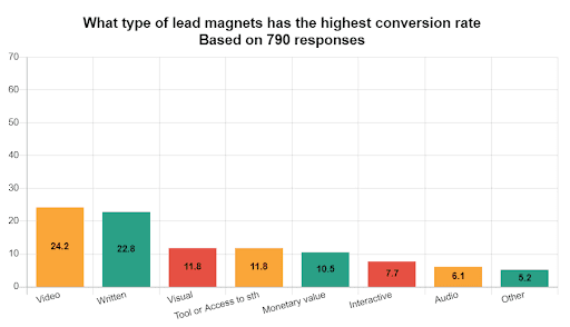
Screenshot taken on the official Infobrandz website
Other popular lead magnet ideas involve toolkits, calculators, and audio, to name a few. Let's take calculators incorporated on a real estate sales page as an example. These tools show leads:
how much they will have to pay;
how much they'll save;
how they should plan their finances.
What's more, it's an excellent example of personalization as calculators allow people to insert their own variables, demonstrating outcomes based on this data.
The Anatomy of Successful Lead Magnet Landing Pages
A lead magnet landing page is a single place dedicated to gathering people's contact details, typically email addresses. It can be a gated page, keeping site visitors focused on the action desired by the company.
What does it typically consist of? Let's overview the main elements that make a landing page compelling enough to convert visitors into leads:
headline (appeals to a specific problem or need; for instance, "Unlock Your Financial Future Today");
visuals (a hero image, infographic, video library, extending the promise of the headline);
copy (an explanation of your lead magnet, why it is beneficial, and what the visitor stands to gain).
These elements should align with your lead magnet's purpose. It involves giving promises that the magnet can keep, using relevant images, and crafting persuasive copy with bullet points, social proof, and a call to action at the end.
Designing a Lead Magnet Landing Page with ConvertCalculator
If you want to create a calculator-based lead magnet, you can do it with ConvertCalculator. It's an easy-to-use tool for designing powerful on-brand calculators, lead generation forms, and mini-apps. We won't detail all the possibilities of this solution; let's just overview the initial steps required for setting up a calculator to display product prices, savings, ROI, or costs:
Open the ConvertCalculator dashboard, click the "+ Element" button, and choose from items, such as Text, Number, or List. Customize them to your needs (color, font, and function). Click "Done", move elements, and utilize advanced features like cloning, deleting, and adjusting.
Access settings under the corresponding icon in the upper right corner, adjust number formatting and language, and enable tracking for analytics tools like Google Analytics or Facebook Pixel. This allows you to measure the effectiveness of your calculator as a lead magnet.
Add elements in the dedicated panel. These are number inputs, sliders, dropdown lists, a Formula, and Layered Images. The tool lets you transform user input into meaningful results and visually display them. ConvertCalculator also offers advanced elements like email capture forms, location pickers, and date selectors to collect more detailed information for more precise follow-up communications.
Insert the codes into your web page HTML to embed the calculator on your dedicated landing page. But don't rush to make it live. Test the functions to ensure they work properly and blend with other content.
Once the testing is done, launch your new lead magnet landing page. Remember integrating the calculator with analytics tools? Monitor its performance through them and use this data to optimize the calculator and landing page further and maximize conversions.
High-Converting Landing Pages with Lead Magnet Examples
In this section, we'll demonstrate several lead magnet landing page examples, including companies utilizing ConvertCalculator. We'll give a detailed assessment of what each example does well and potential areas for improvement. Let's start.
1. Rift Photography
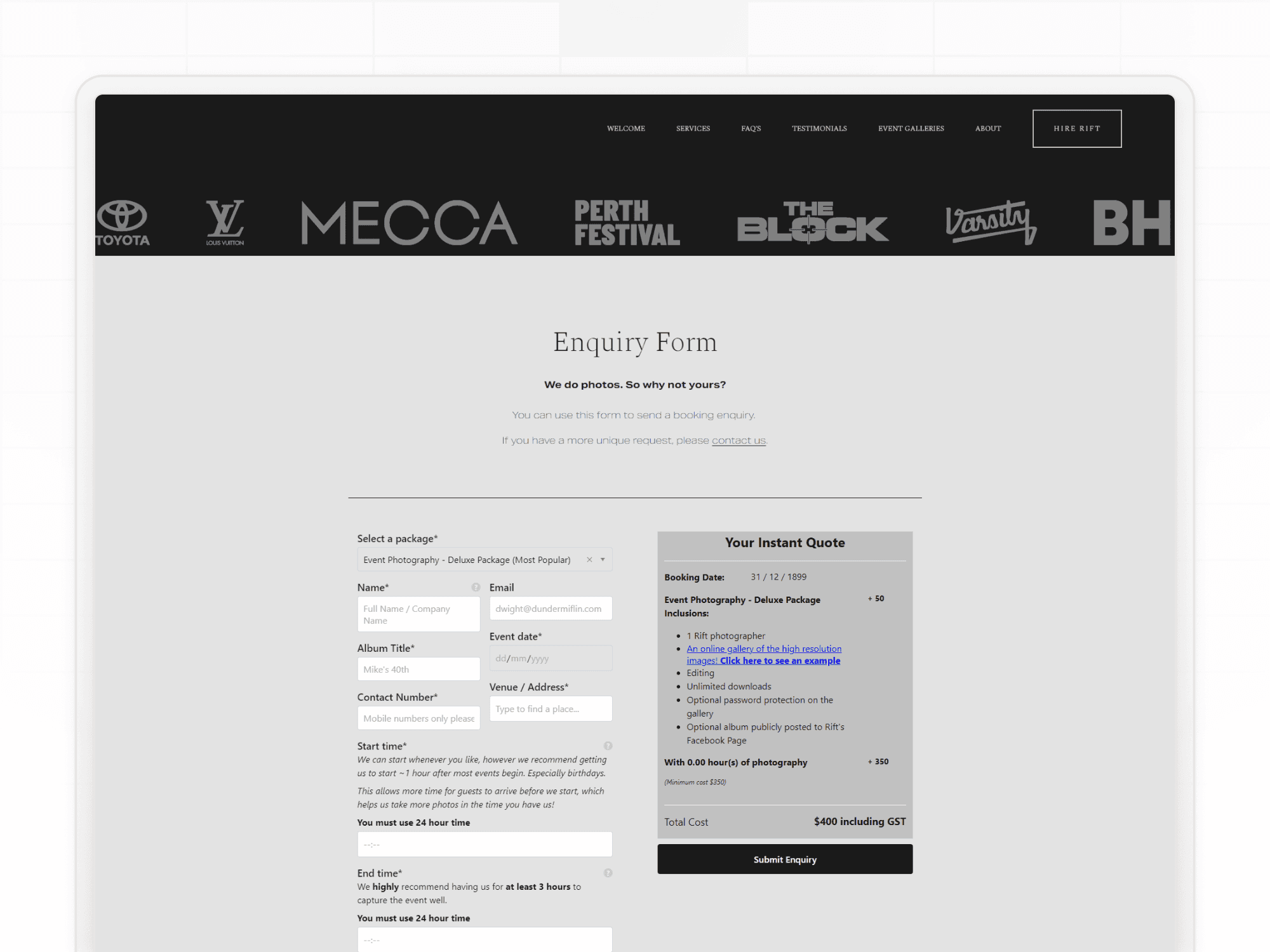
Screenshot taken on the official Rift Photography website
The first example on this list is from Rift Photography, the event photography service provider. On this landing page, Rift Photography allows you to calculate the needed service pricing according to the scope of work.
Strengths:
Instant quote tool, showing how much a service will cost;
Automation and integration with Zapier and Google Calendar to speed up the booking process. The time between inquiry and confirmation is minimal;
Review section, acting as powerful social proof.
Pleasing user experience conveyed through the conditional logic in the form design. The form fields adapt based on user responses, eliminating irrelevant questions.
Areas for improvement:
The page could benefit from adding more visuals and injecting more brand personality, such as:
branded elements like icons;
subtle use of brand motifs in the background.
Incorporating sliders for options where users can visually see changes might enhance user interaction and satisfaction.
2. Eltex
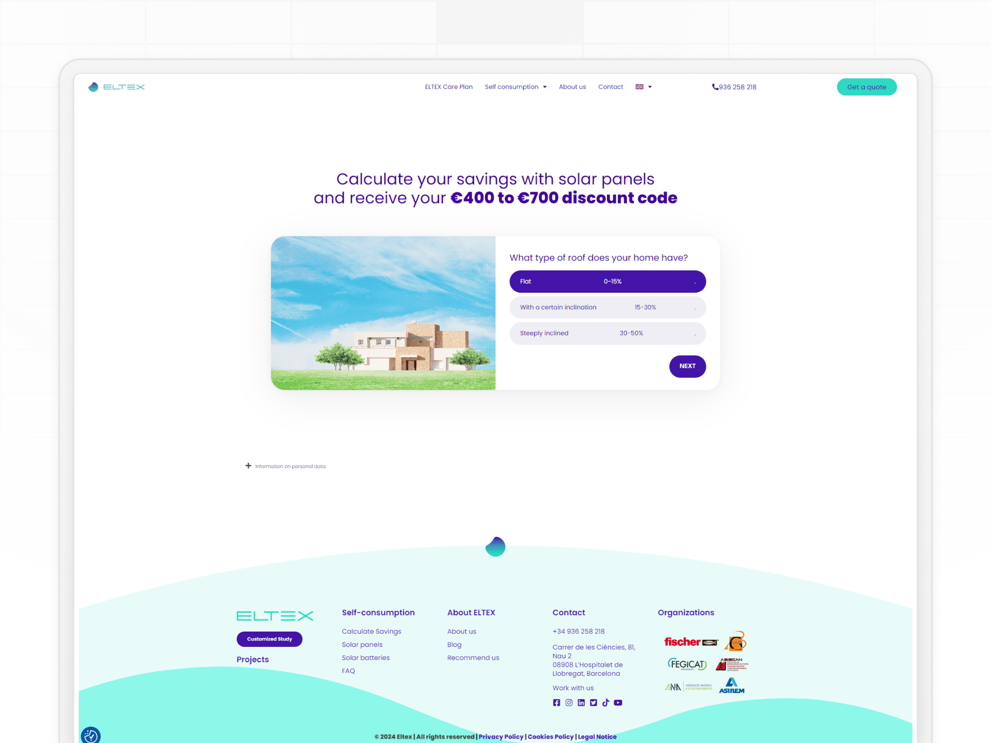
Screenshot taken on the official Eltex website
Eltex is a Belgian solar energy startup that assists residential and business clients with purchasing and installing solar panels, battery systems, and EV charging stations. It's also one of ConvertCalculator's clients. On its page, you can see the interactive calculator to measure savings and system sizes. Let's see what it does well on its lead magnet landing page.
Strengths:
Interactive calculator that engages users and provides them with valuable information;
The unique selling propositions (savings, quality assurance, and lifetime service) are clearly stated;
The lead magnet takes the focal part of the page, matching the website's overall color scheme and typography.
Immediate value (potential savings calculations and a €400 to €700 discount code upon completion).
Areas for improvement:
As users leave personal information, the company can eliminate their doubts by giving data privacy reassurance, such as privacy policy and how the data will be used.
It's not very clear what will happen after submitting the information. The interactive lead magnet may specify whether agents will schedule a meeting or send an email with more personalized information.
The lead capture form may have provided explanatory tooltips, such as a pop-up detailing different terms. For example, "With a certain inclination" could be described as "This means your roof is angled and not flat, typically used to promote drainage."
3. Salesforce
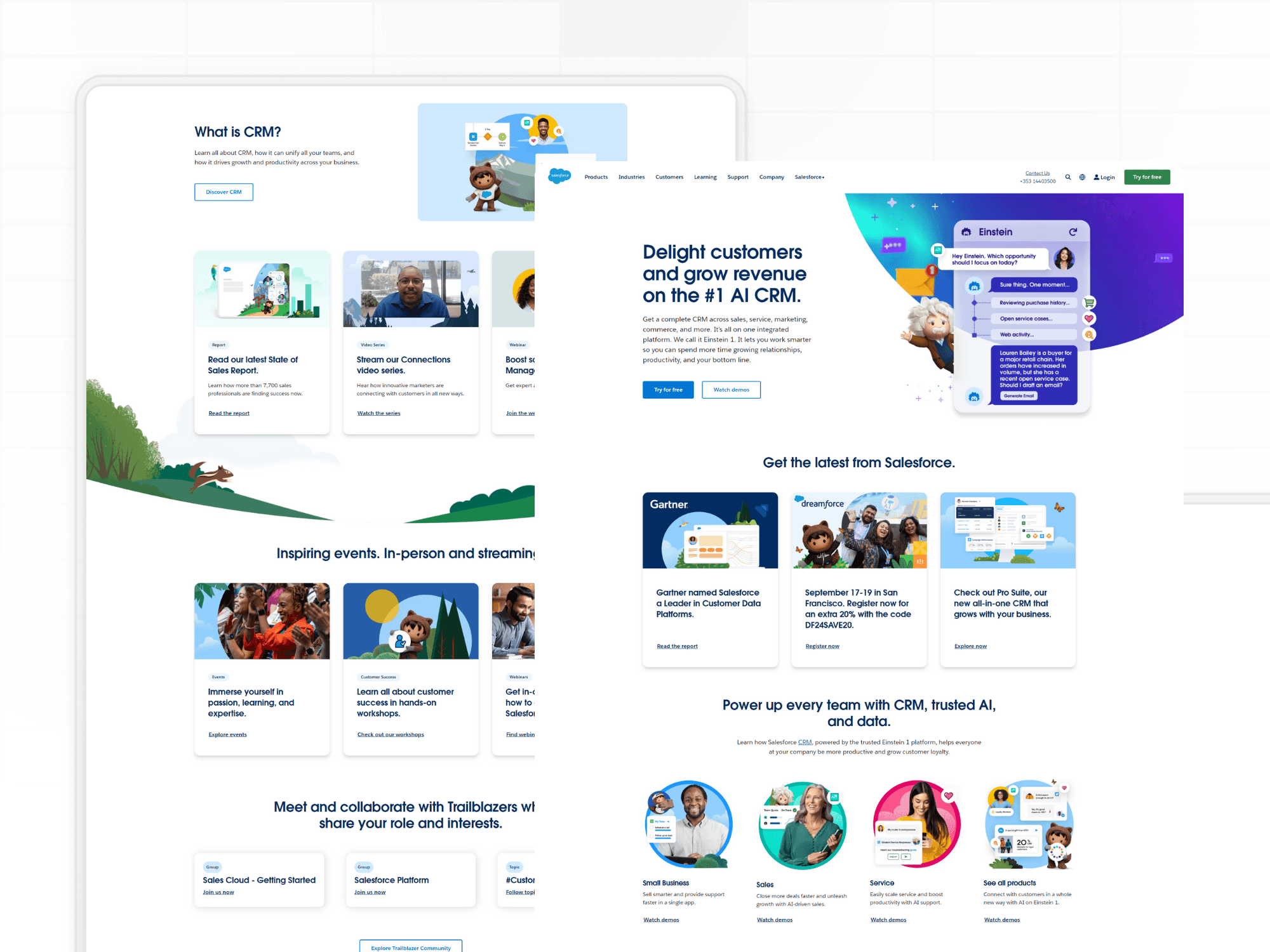
Screenshot taken on the official Salesforce website
The company needs no introduction, as it's an established mogul in the digital market. Let's take a glance at how it wins over more leads with the help of the landing page.
Strengths:
The illustrative landing page is packed with comprehensive information on features and benefits and visuals to entice visitors to explore the product;
Clear, concise messaging, such as "Meet Einstein 1. The #1 AI CRM, now even smarter," helps set expectations and builds interest.
Customer testimonials and badges, such as "Salesforce is voted the #1 Global Software Company on G2," reinforce Salesforce's reliability and industry leadership, encouraging users to engage with the lead magnet.
Areas for improvement:
Overwhelming amount of information. While this is an advantage, it can also be too much for a first-time visitor. The page could be streamlined to direct the user's attention to the primary lead magnet and the conversion action ("Get started").
Call-to-action clarity. It's not understandable what the click on the CTA will initiate. Will the user schedule a call? Will they see a demo? Will they have to register to start using the tool immediately? Clarifying what a lead can expect after clicking can help set the right expectations and reduce bounce rates.
4. Madison Marquette
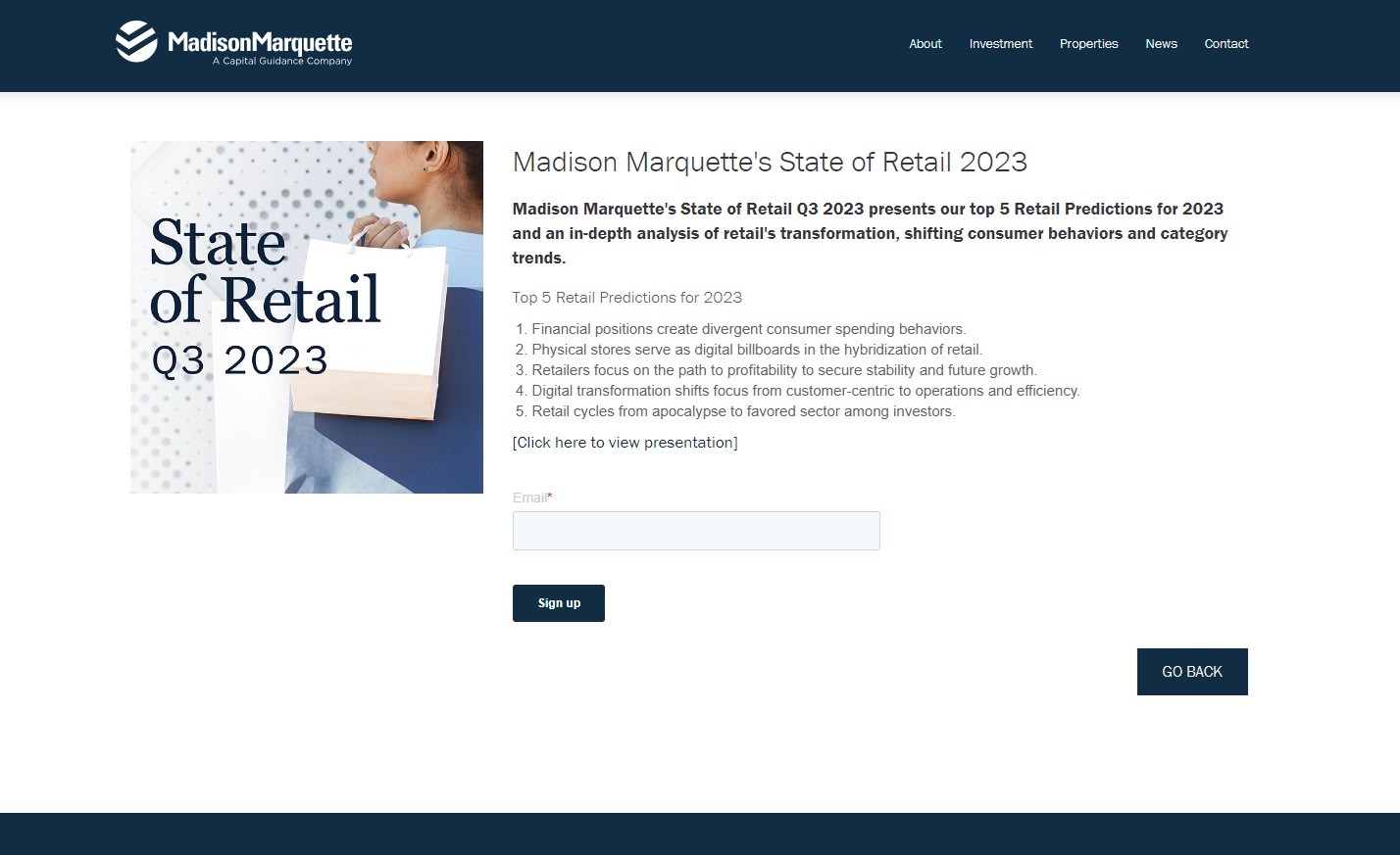
Screenshot taken on the official Madison Marquette website
The real estate player Madison Marquette presents a simple and professionally-looking landing page with several lead magnets throughout the website. Let's focus on one of them.
Strengths:
Focused content: You won't get tired of this page. All you see is a concise introduction to the State of Retail report with a few bullet points casting light on what you're going to get. It can be a strong draw for the target audience in the commercial real estate sector.
A simple sign-up form: There is only one action required: typing in your email address.
Areas for improvement:
Engagement features: Incorporating more interactive elements, like videos or infographics, could enhance page activity and participation.
Lack of preview or teaser: What's included in the report? A snippet, sneak peek, or graphical abstract could help potential subscribers gauge the content’s relevance and quality before submitting their email.
5. Sunbasket
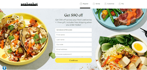
Screenshot taken on the official Sunbasket website
A subscription meal delivery service, Sunbasket, is the next item on our list of lead magnet landing page examples. Let's dive in.
Strengths:
The hero image is extremely vivid and visually appealing, demonstrating the meals that food lovers can expect.
The offer of $90 off plus a free gift is a solid financial incentive, reducing the perceived risk of trying a new service like Sunbasket.
The lead magnet takes the central place and is at the top of the page, so it's easy to spot when landing.
The form to access the lead magnet is straightforward, requesting only key points: a name, email, and zip code.
Areas for improvement:
What is the promised gift? Specifying what the customer will receive could enhance the attractiveness of the offer.
How will the store protect the provided data? Again, adding a small note on data privacy or a link to the privacy policy won't hurt but will make the form more appealing to cautious consumers.
The store might explain in a little bit more detail how the discount is applied over the first 4 deliveries for customers to understand how their next orders will be delivered.
6. Nauto
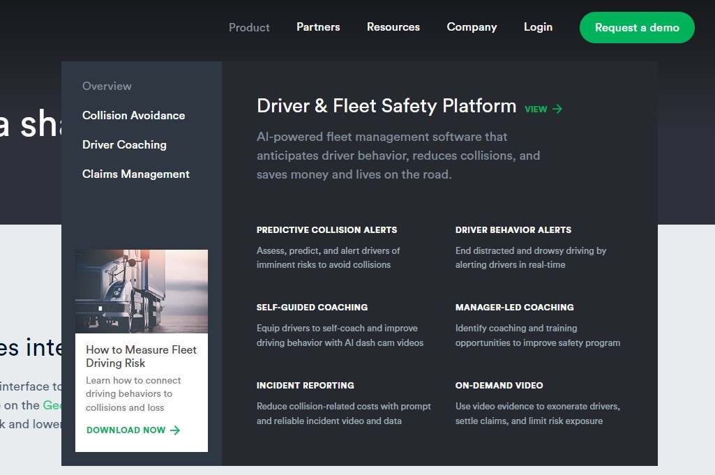
Screenshot taken on the official Nauto website
The transportation startup Nauto offers an AI driver and fleet safety platform to help identify and stop distracted driving. Its lead magnet is subtly integrated into the content, offering a free download. This valuable resource is likely aimed at fleet managers looking to reduce risks and improve safety within their operations. Let's analyze the pluses and minuses of this free content.
Strengths:
The white paper or ultimate guide is an effective lead magnet landing page demonstration. It describes that the user will find insights into measuring and managing fleet driving risks, a critical concern for fleet managers.
The lead magnet is positioned alongside related content, assisting consumers in the awareness stage of the marketing funnel to move further on the buyer's journey.
The "Download now" button stands out from the other elements, using a contrasting color and white space. The direct CTA makes it clear what the visitor needs to do to receive the lead magnet, helping to increase the conversion rate.
Areas for improvement:
The lead magnet could benefit from even more visibility. Currently, it appears as part of a list of features and benefits, which might cause some visitors to overlook it. Making it more visually distinct or providing a dedicated section could improve visibility.
Outlining a few critical insights or bullet points for potential downloaders about what they will learn from the free resource could significantly increase its perceived value.
The lead magnet strategy should offer an easy opt-in process. Now, there is some friction when downloading the document.
7. Zillow
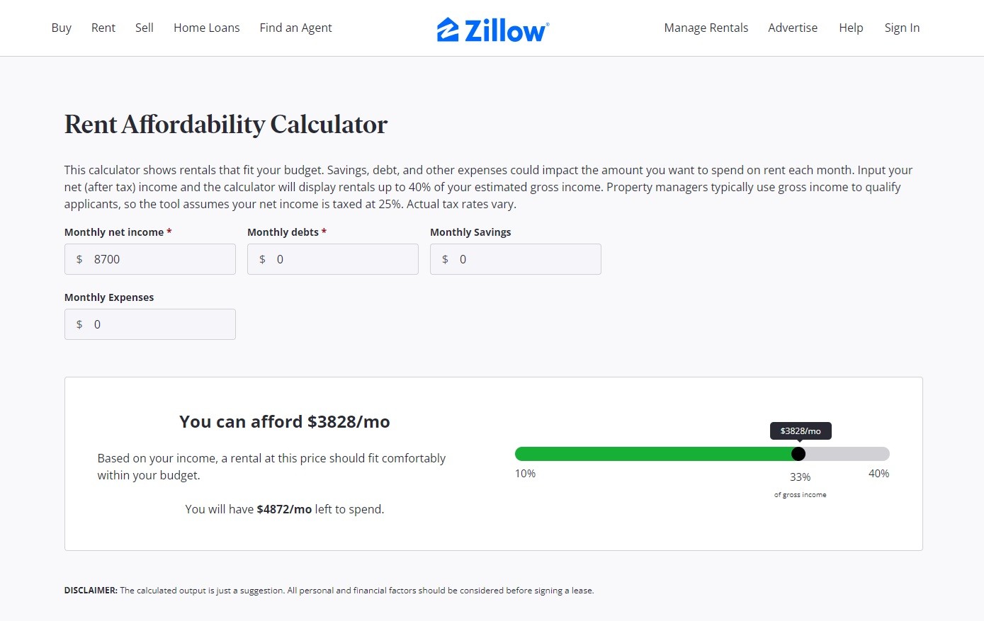
Screenshot taken on the official Zillow website
Zillow is a bustling and booming real estate marketplace. Its dedicated lead magnet landing page features a "Rent Affordability Calculator," which allows website visitors to determine how much they can afford to spend on rent based on their:
monthly net income;
monthly debts;
other financial commitments.
Strengths:
It addresses relevant pain points of site visitors — measuring how much they can afford in rent.
The landing page showcases a clean, user-friendly design. Users can quickly input their financial details, toggle the slider, and adjust their spending, savings, and rental budget.
The tool provides instant calculations and visualization, keeping consumers engaged and delivering immediate value.
Connection to additional resources is very thoughtful, boosting the lead magnet’s effectiveness.
Areas for improvement:
While the calculator looks flawless, incorporating more personalized elements (such as preferred rental locations, desired home features, etc.) could make the lead magnet landing page even more useful and engaging.
As far as the extra materials are concerned, links to available rental listings within your budget, on-demand webinars, free consultation, or tips on how to manage rental expenses could enhance the user experience on the landing page.
Best Practices for Lead Magnet Landing Pages
So, what lessons have we learned from the lead magnet examples above? Here’s an in-depth look at some essentials to remember when crafting your lead magnet landing page to maximize the opt-in rate, boost the conversion rate, and acquire new leads.
Use Strong CTAs
Great lead magnets display CTAs that tell users what to do next. They should be prominent, use action-oriented language, and explain what the person commits to. You may use contrasting colors or place the CTAs strategically after compelling content that underscores their value.
Leverage Testimonials
As seen in popular lead magnets, they're usually accompanied by social proof. Reviews and testimonials can significantly influence decision-making. Yet, they should be authentic, relate to the target audience's potential concerns, and highlight the benefits of the offer.
Preserve Consistency in Branding
Your landing pages and lead magnets are part of the overall user experience. So, maintain a consistent brand image in terms of colors, fonts, and messaging. Visitors should understand they're on your website if they've arrived from your marketing campaigns.
Optimize Speed and Mobile Design
Performance optimization ensures the landing page loads rapidly without delaying the content. How can you achieve that? There are various strategies, from working on the code to compressing images. Consider your lead magnet landing page design and see where you can accelerate the loading.
A similar rule applies to the website's mobile version. Check how convenient your lead magnet, pop-up lead form, and CTA buttons are on a smartphone. Mobile-friendliness involves:
responsive design;
fast loading times;
navigable interfaces on smaller screens.
Pay attention to page analysis and tools like Google PageSpeed Insights, Google Analytics (GA), and heat mapping software like Hotjar. Based on metrics such as time on page, bounce rate, and conversion rate, pinpoint what's working and what's not.
Test the Landing Page
Test everything you can:
colors;
buttons;
images;
headlines;
the phrasing of your CTAs;
the overall layout of your lead magnet landing pages.
For example, even the wording of your headline or the page structure may impact the user response. If you test two different versions of the same element (i.e., conduct A/B testing), you might uncover which one drives better outcomes. Utilizing tools like VWO or Google Optimize can help streamline this process.
Integrate with Email Marketing Automation Tools
Connecting your lead magnet strategy with email marketing automation platforms enables you to minimize the effort to sustain communication with prospects. As soon as they order free consultation or complete the multi-step form, the system logs their activity and sends targeted emails, such as:
a follow-up message;
a welcome email;
exclusive offers;
invitations, etc.
This allows you to leverage lead generation campaigns, transforming initial interest into active engagement.
Keep the Lead Magnet Dynamic and Personalized
Create content that ensures active participation. Whether it's a map, calculator, or infographic, dynamic and personalized content can boost the likelihood of a purchase for 76% of new consumers and 78% of existing customers.
Conclusion
What is a lead magnet landing page? It's where you can offer something valuable to website visitors and get their contact details in return.
There are various types of lead magnets:
a blog post;
a cheat sheet;
free trials.
And while you can offer them throughout the website, having a dedicated page can give them more spotlight. For example, if you promote a webinar, a webinar landing page can be a convenient solution to provide an overview of the upcoming event and place a form where people can leave their names, email addresses, and other details.
If you're ready to take your lead magnet approach to the next level and construct custom calculators, quizzes, or booking forms, ConvertCalculator is an excellent choice. It simplifies the creation of these interactive tools, allowing you to embed them directly on your landing page. This solution can enhance user engagement and serve as a potent lead generation mechanism, gathering data and driving conversions.
Experiment with different types of lead magnets. Test what resonates with your audience. Try new formats, ranging from a free trial sign-up form to an in-depth blog post that addresses pressing industry challenges. Stay agile, and good luck designing your persuasive lead magnet landing pages.
Would you share personal contact details on any website you land on? Most likely, you answer "No". That's why you shouldn't expect visitors to do it on your website, either.
To encourage people to engage with your brand and initiate potentially long-standing relationships, you need something valuable in return. Why not try a lead magnet?
Lead magnets are pivotal tools in digital marketing. They offer potential customers knowledge in the form of a free eBook, white papers, webinars, interactive calculators, and so on. However, a valuable lead magnet requires a dedicated place to be visible to the target audience. That's where the need for a lead magnet landing page emerges.
In this article, we'll teach you how to organize such a page and create visually appealing and effective lead magnets. To illustrate our main ideas, we'll share real-life examples of lead magnet landing pages.
Lead Magnets: What Are They and Why Do We Need Them?
A lead magnet is a type of marketing tool that solicits contact information from website visitors in exchange for a long-form document (e.g., a cheat sheet, checklist, PDF), free consultations, personal finance coaching calls, a discount code, etc. It acts as an incentive because traffic won't transform into paid leads on its own.
However, having people download a free report or something you offer is just half the deal. You need to sustain further communication. As such, an effective lead magnet should:
attract visitors;
enhance user engagement;
generate leads;
boost conversions;
help guide potential buyers deeper into the sales funnel.
Moreover, it should streamline the user experience on a landing page. How? If you employ calculators, the tool enables users to gain valuable insights without filling out lengthy form fields or sifting through dense content. This approach not only increments conversion rates but also positions your brand as a helpful and innovative solution provider.
Other lead magnet benefits include:
enhancing brand perception;
ensuring customer loyalty;
unlocking segmentation opportunities.
If you already have a lead magnet landing page and struggle to achieve these advantages, there may be issues with the user experience. Conduct a website UX audit to understand what may prevent users from fully engaging with your lead magnet.
Types of Lead Magnets
Lead magnets vary in their forms, ranging from video to text-based and interactive content. For example, eBooks are well-suited for in-depth dives into topics, providing consumers with probably the greatest amount of knowledge.
Webinars, in turn, not only attract leads but also hold them in a real-life dialogue. They're more dynamic, engaging, and authentic. After the webinar, you can also send follow-up messages to keep the audience interested long after the session ends.
You don't necessarily have to host live events to convince visitors to buy your goods or services. According to statistics, video and written content formats are the most successful lead magnets with the highest conversion rates.
Screenshot taken on the official Infobrandz website
Other popular lead magnet ideas involve toolkits, calculators, and audio, to name a few. Let's take calculators incorporated on a real estate sales page as an example. These tools show leads:
how much they will have to pay;
how much they'll save;
how they should plan their finances.
What's more, it's an excellent example of personalization as calculators allow people to insert their own variables, demonstrating outcomes based on this data.
The Anatomy of Successful Lead Magnet Landing Pages
A lead magnet landing page is a single place dedicated to gathering people's contact details, typically email addresses. It can be a gated page, keeping site visitors focused on the action desired by the company.
What does it typically consist of? Let's overview the main elements that make a landing page compelling enough to convert visitors into leads:
headline (appeals to a specific problem or need; for instance, "Unlock Your Financial Future Today");
visuals (a hero image, infographic, video library, extending the promise of the headline);
copy (an explanation of your lead magnet, why it is beneficial, and what the visitor stands to gain).
These elements should align with your lead magnet's purpose. It involves giving promises that the magnet can keep, using relevant images, and crafting persuasive copy with bullet points, social proof, and a call to action at the end.
Designing a Lead Magnet Landing Page with ConvertCalculator
If you want to create a calculator-based lead magnet, you can do it with ConvertCalculator. It's an easy-to-use tool for designing powerful on-brand calculators, lead generation forms, and mini-apps. We won't detail all the possibilities of this solution; let's just overview the initial steps required for setting up a calculator to display product prices, savings, ROI, or costs:
Open the ConvertCalculator dashboard, click the "+ Element" button, and choose from items, such as Text, Number, or List. Customize them to your needs (color, font, and function). Click "Done", move elements, and utilize advanced features like cloning, deleting, and adjusting.
Access settings under the corresponding icon in the upper right corner, adjust number formatting and language, and enable tracking for analytics tools like Google Analytics or Facebook Pixel. This allows you to measure the effectiveness of your calculator as a lead magnet.
Add elements in the dedicated panel. These are number inputs, sliders, dropdown lists, a Formula, and Layered Images. The tool lets you transform user input into meaningful results and visually display them. ConvertCalculator also offers advanced elements like email capture forms, location pickers, and date selectors to collect more detailed information for more precise follow-up communications.
Insert the codes into your web page HTML to embed the calculator on your dedicated landing page. But don't rush to make it live. Test the functions to ensure they work properly and blend with other content.
Once the testing is done, launch your new lead magnet landing page. Remember integrating the calculator with analytics tools? Monitor its performance through them and use this data to optimize the calculator and landing page further and maximize conversions.
High-Converting Landing Pages with Lead Magnet Examples
In this section, we'll demonstrate several lead magnet landing page examples, including companies utilizing ConvertCalculator. We'll give a detailed assessment of what each example does well and potential areas for improvement. Let's start.
1. Rift Photography
Screenshot taken on the official Rift Photography website
The first example on this list is from Rift Photography, the event photography service provider. On this landing page, Rift Photography allows you to calculate the needed service pricing according to the scope of work.
Strengths:
Instant quote tool, showing how much a service will cost;
Automation and integration with Zapier and Google Calendar to speed up the booking process. The time between inquiry and confirmation is minimal;
Review section, acting as powerful social proof.
Pleasing user experience conveyed through the conditional logic in the form design. The form fields adapt based on user responses, eliminating irrelevant questions.
Areas for improvement:
The page could benefit from adding more visuals and injecting more brand personality, such as:
branded elements like icons;
subtle use of brand motifs in the background.
Incorporating sliders for options where users can visually see changes might enhance user interaction and satisfaction.
2. Eltex
Screenshot taken on the official Eltex website
Eltex is a Belgian solar energy startup that assists residential and business clients with purchasing and installing solar panels, battery systems, and EV charging stations. It's also one of ConvertCalculator's clients. On its page, you can see the interactive calculator to measure savings and system sizes. Let's see what it does well on its lead magnet landing page.
Strengths:
Interactive calculator that engages users and provides them with valuable information;
The unique selling propositions (savings, quality assurance, and lifetime service) are clearly stated;
The lead magnet takes the focal part of the page, matching the website's overall color scheme and typography.
Immediate value (potential savings calculations and a €400 to €700 discount code upon completion).
Areas for improvement:
As users leave personal information, the company can eliminate their doubts by giving data privacy reassurance, such as privacy policy and how the data will be used.
It's not very clear what will happen after submitting the information. The interactive lead magnet may specify whether agents will schedule a meeting or send an email with more personalized information.
The lead capture form may have provided explanatory tooltips, such as a pop-up detailing different terms. For example, "With a certain inclination" could be described as "This means your roof is angled and not flat, typically used to promote drainage."
3. Salesforce
Screenshot taken on the official Salesforce website
The company needs no introduction, as it's an established mogul in the digital market. Let's take a glance at how it wins over more leads with the help of the landing page.
Strengths:
The illustrative landing page is packed with comprehensive information on features and benefits and visuals to entice visitors to explore the product;
Clear, concise messaging, such as "Meet Einstein 1. The #1 AI CRM, now even smarter," helps set expectations and builds interest.
Customer testimonials and badges, such as "Salesforce is voted the #1 Global Software Company on G2," reinforce Salesforce's reliability and industry leadership, encouraging users to engage with the lead magnet.
Areas for improvement:
Overwhelming amount of information. While this is an advantage, it can also be too much for a first-time visitor. The page could be streamlined to direct the user's attention to the primary lead magnet and the conversion action ("Get started").
Call-to-action clarity. It's not understandable what the click on the CTA will initiate. Will the user schedule a call? Will they see a demo? Will they have to register to start using the tool immediately? Clarifying what a lead can expect after clicking can help set the right expectations and reduce bounce rates.
4. Madison Marquette
Screenshot taken on the official Madison Marquette website
The real estate player Madison Marquette presents a simple and professionally-looking landing page with several lead magnets throughout the website. Let's focus on one of them.
Strengths:
Focused content: You won't get tired of this page. All you see is a concise introduction to the State of Retail report with a few bullet points casting light on what you're going to get. It can be a strong draw for the target audience in the commercial real estate sector.
A simple sign-up form: There is only one action required: typing in your email address.
Areas for improvement:
Engagement features: Incorporating more interactive elements, like videos or infographics, could enhance page activity and participation.
Lack of preview or teaser: What's included in the report? A snippet, sneak peek, or graphical abstract could help potential subscribers gauge the content’s relevance and quality before submitting their email.
5. Sunbasket
Screenshot taken on the official Sunbasket website
A subscription meal delivery service, Sunbasket, is the next item on our list of lead magnet landing page examples. Let's dive in.
Strengths:
The hero image is extremely vivid and visually appealing, demonstrating the meals that food lovers can expect.
The offer of $90 off plus a free gift is a solid financial incentive, reducing the perceived risk of trying a new service like Sunbasket.
The lead magnet takes the central place and is at the top of the page, so it's easy to spot when landing.
The form to access the lead magnet is straightforward, requesting only key points: a name, email, and zip code.
Areas for improvement:
What is the promised gift? Specifying what the customer will receive could enhance the attractiveness of the offer.
How will the store protect the provided data? Again, adding a small note on data privacy or a link to the privacy policy won't hurt but will make the form more appealing to cautious consumers.
The store might explain in a little bit more detail how the discount is applied over the first 4 deliveries for customers to understand how their next orders will be delivered.
6. Nauto
Screenshot taken on the official Nauto website
The transportation startup Nauto offers an AI driver and fleet safety platform to help identify and stop distracted driving. Its lead magnet is subtly integrated into the content, offering a free download. This valuable resource is likely aimed at fleet managers looking to reduce risks and improve safety within their operations. Let's analyze the pluses and minuses of this free content.
Strengths:
The white paper or ultimate guide is an effective lead magnet landing page demonstration. It describes that the user will find insights into measuring and managing fleet driving risks, a critical concern for fleet managers.
The lead magnet is positioned alongside related content, assisting consumers in the awareness stage of the marketing funnel to move further on the buyer's journey.
The "Download now" button stands out from the other elements, using a contrasting color and white space. The direct CTA makes it clear what the visitor needs to do to receive the lead magnet, helping to increase the conversion rate.
Areas for improvement:
The lead magnet could benefit from even more visibility. Currently, it appears as part of a list of features and benefits, which might cause some visitors to overlook it. Making it more visually distinct or providing a dedicated section could improve visibility.
Outlining a few critical insights or bullet points for potential downloaders about what they will learn from the free resource could significantly increase its perceived value.
The lead magnet strategy should offer an easy opt-in process. Now, there is some friction when downloading the document.
7. Zillow
Screenshot taken on the official Zillow website
Zillow is a bustling and booming real estate marketplace. Its dedicated lead magnet landing page features a "Rent Affordability Calculator," which allows website visitors to determine how much they can afford to spend on rent based on their:
monthly net income;
monthly debts;
other financial commitments.
Strengths:
It addresses relevant pain points of site visitors — measuring how much they can afford in rent.
The landing page showcases a clean, user-friendly design. Users can quickly input their financial details, toggle the slider, and adjust their spending, savings, and rental budget.
The tool provides instant calculations and visualization, keeping consumers engaged and delivering immediate value.
Connection to additional resources is very thoughtful, boosting the lead magnet’s effectiveness.
Areas for improvement:
While the calculator looks flawless, incorporating more personalized elements (such as preferred rental locations, desired home features, etc.) could make the lead magnet landing page even more useful and engaging.
As far as the extra materials are concerned, links to available rental listings within your budget, on-demand webinars, free consultation, or tips on how to manage rental expenses could enhance the user experience on the landing page.
Best Practices for Lead Magnet Landing Pages
So, what lessons have we learned from the lead magnet examples above? Here’s an in-depth look at some essentials to remember when crafting your lead magnet landing page to maximize the opt-in rate, boost the conversion rate, and acquire new leads.
Use Strong CTAs
Great lead magnets display CTAs that tell users what to do next. They should be prominent, use action-oriented language, and explain what the person commits to. You may use contrasting colors or place the CTAs strategically after compelling content that underscores their value.
Leverage Testimonials
As seen in popular lead magnets, they're usually accompanied by social proof. Reviews and testimonials can significantly influence decision-making. Yet, they should be authentic, relate to the target audience's potential concerns, and highlight the benefits of the offer.
Preserve Consistency in Branding
Your landing pages and lead magnets are part of the overall user experience. So, maintain a consistent brand image in terms of colors, fonts, and messaging. Visitors should understand they're on your website if they've arrived from your marketing campaigns.
Optimize Speed and Mobile Design
Performance optimization ensures the landing page loads rapidly without delaying the content. How can you achieve that? There are various strategies, from working on the code to compressing images. Consider your lead magnet landing page design and see where you can accelerate the loading.
A similar rule applies to the website's mobile version. Check how convenient your lead magnet, pop-up lead form, and CTA buttons are on a smartphone. Mobile-friendliness involves:
responsive design;
fast loading times;
navigable interfaces on smaller screens.
Pay attention to page analysis and tools like Google PageSpeed Insights, Google Analytics (GA), and heat mapping software like Hotjar. Based on metrics such as time on page, bounce rate, and conversion rate, pinpoint what's working and what's not.
Test the Landing Page
Test everything you can:
colors;
buttons;
images;
headlines;
the phrasing of your CTAs;
the overall layout of your lead magnet landing pages.
For example, even the wording of your headline or the page structure may impact the user response. If you test two different versions of the same element (i.e., conduct A/B testing), you might uncover which one drives better outcomes. Utilizing tools like VWO or Google Optimize can help streamline this process.
Integrate with Email Marketing Automation Tools
Connecting your lead magnet strategy with email marketing automation platforms enables you to minimize the effort to sustain communication with prospects. As soon as they order free consultation or complete the multi-step form, the system logs their activity and sends targeted emails, such as:
a follow-up message;
a welcome email;
exclusive offers;
invitations, etc.
This allows you to leverage lead generation campaigns, transforming initial interest into active engagement.
Keep the Lead Magnet Dynamic and Personalized
Create content that ensures active participation. Whether it's a map, calculator, or infographic, dynamic and personalized content can boost the likelihood of a purchase for 76% of new consumers and 78% of existing customers.
Conclusion
What is a lead magnet landing page? It's where you can offer something valuable to website visitors and get their contact details in return.
There are various types of lead magnets:
a blog post;
a cheat sheet;
free trials.
And while you can offer them throughout the website, having a dedicated page can give them more spotlight. For example, if you promote a webinar, a webinar landing page can be a convenient solution to provide an overview of the upcoming event and place a form where people can leave their names, email addresses, and other details.
If you're ready to take your lead magnet approach to the next level and construct custom calculators, quizzes, or booking forms, ConvertCalculator is an excellent choice. It simplifies the creation of these interactive tools, allowing you to embed them directly on your landing page. This solution can enhance user engagement and serve as a potent lead generation mechanism, gathering data and driving conversions.
Experiment with different types of lead magnets. Test what resonates with your audience. Try new formats, ranging from a free trial sign-up form to an in-depth blog post that addresses pressing industry challenges. Stay agile, and good luck designing your persuasive lead magnet landing pages.
Continue reading


More leads in less time_
Start building the future of your company, today
Create powerful on brand calculators, lead generation forms and apps that automate your marketing and sales processes
Start with a template
Find inspiration or customize an outstanding template, complete with functional formulas and flows to help you get started.
Let us build for you
We can build your calculator, and afterwards you can always make changes yourself. Our service starts at just $250.