
All categories


Let's face it plain old text can get kinda boring as bat doo doo when you're trying to make an impression…
Data displayed by your calculators doesn't have to be boring. There are plenty of ways to make it pop so it's engaging and highlights the important bits.
People use your forms and calculators to get information. How you display that information can make or break your form's success.
Think about displaying results as interactive visuals, such as graphs, charts, or dynamic elements, and transforming your boring form into a dynamic dopamine dispenser.
Turning static data into an easier-to-understand visual is as easy as adding a chart element to your form—and yep, that's pretty easy.
So let's talk about what Interactive Visuals are, the best ways to incorporate them, and have a look at some examples…
Why use Interactive Visuals?
When users can see their results as a graph or chart in real time, they interact with the content and gain clearer insights faster. And that's great for you.
Here are some good reasons to use Interactive Visuals:
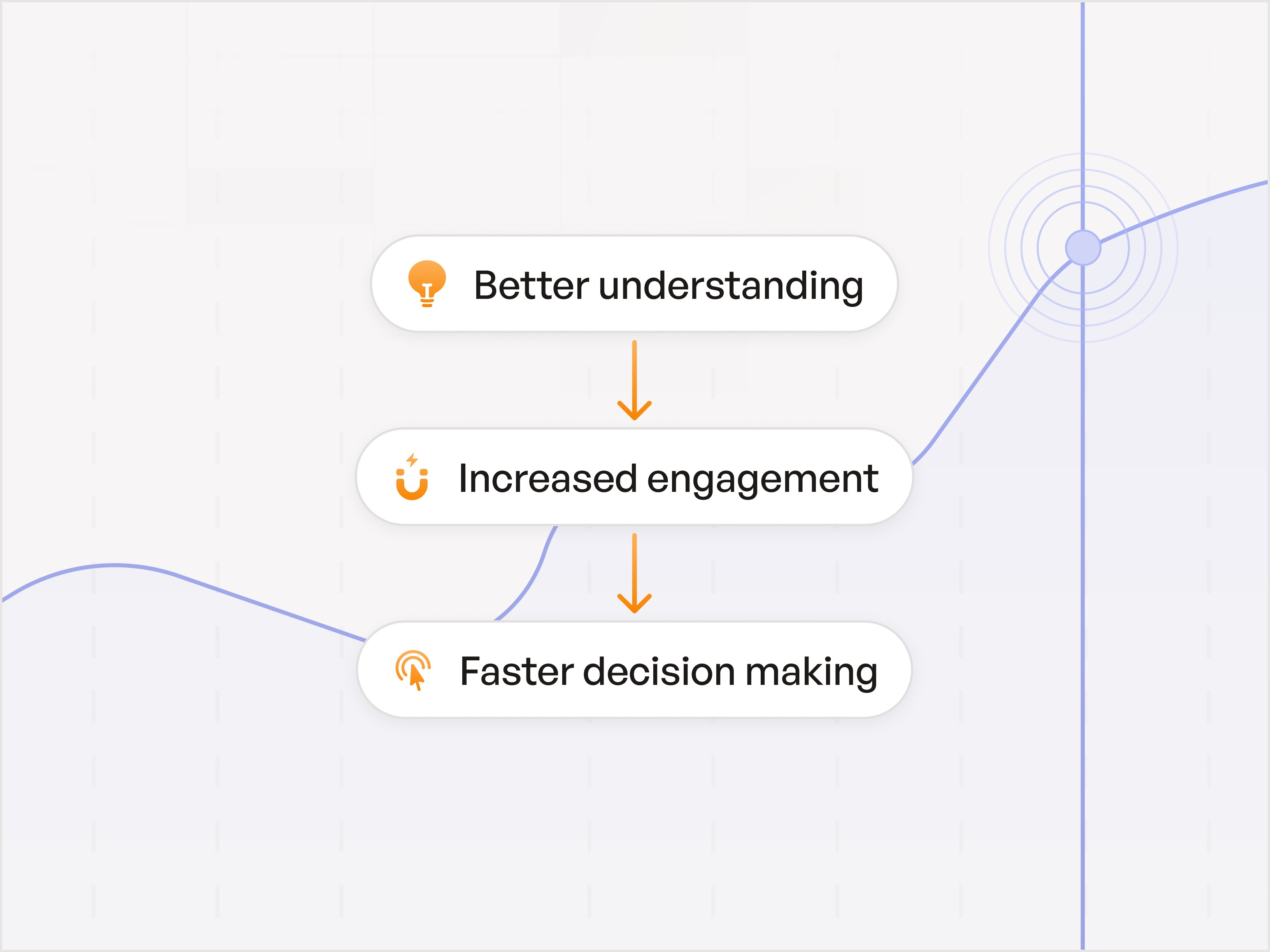
Better Understanding
Visuals help users comprehend complex data more easily.
Transforming numbers and abstract concepts into visuals like charts, graphs, and infographics helps users quickly grasp trends, patterns, and outliers.
Visual simplification is great for users who may not have a strong background in data analysis. It makes it easier for them to understand and act on the information presented.
Increased Engagement
Interactive elements encourage users to spend more time on your calculator.
When users can manipulate data inputs and see instant visual changes, they are more likely to explore different scenarios and outcomes.
Hands-on interaction makes the experience more engaging and increases the likelihood of users returning to use the tool multiple times.
Enhanced engagement leads to higher user satisfaction and loyalty.
Faster Decision Making
Real-time feedback allows users to make more informed decisions based on visual data representations.
As users adjust variables and see immediate updates to graphs and charts, they can quickly evaluate the impact of their choices.
Instant feedback loops reduce the time needed to analyze data and make decisions, empowering users to act confidently and promptly.
For instance, a financial calculator that updates projections in real-time can help users swiftly choose the best investment option without extensive manual calculations.
Examples
Here are a couple of examples of how you can show, not tell, using images.
iAv2yPwxmbx9wbgpP
Interactive Visuals: A dynamic savings projection chart that adjusts based on user inputs such as current age, retirement age, current savings, monthly contributions, and expected annual return rate.
The chart visually shows how the savings will grow over time, highlighting key milestones and projected retirement income.
FBAkmw8AcKarLedpc
Interactive Visuals: An amortization schedule visual that shows a breakdown of each payment over the loan term, highlighting the portions of each payment that go towards principal and interest.
As users input different loan amounts, interest rates, and loan terms, the schedule updates dynamically to reflect the new amortization details.
Best Practices
To make your calculators more engaging with interactive visuals, consider the following:
Visualization Options: Choose the right chart types (e.g., line, bar, pie) to best represent different data sets (see below).
User Customization: Allow users to customize the visual displays, such as choosing which data to visualize.
Comparative Analysis: Enable users to compare multiple data sets side by side for better decision-making.
Tooltips and Annotations: Provide additional context by adding tooltips or annotations to key data points on the charts.
Export Options: Allow users to export the visual data as images or PDFs for easy sharing and offline use.
Using these features, you can improve user experience and make your calculators more engaging, informative, and valuable.
Best Interactive Visuals for Your Data
When it comes to displaying data, one size does not fit all. Let's look at the various ways you can present data to suit different user needs.
Types of Charts and Graphs
Bar Charts
Usage: Ideal for comparing discrete categories.
Example: Comparing monthly expenses across different categories like rent, groceries, and entertainment.
Benefit: Provides a clear visual distinction between different data points.
Line Graphs
Usage: Perfect for showing trends over time.
Example: Displaying the growth of savings over several years.
Benefit: Helps users see how values change over a period.
Pie Charts
Usage: Best for showing parts of a whole.
Example: Breaking down the percentage of your budget allocated to various expenses.
Benefit: Easily demonstrates the proportion of each category within the total budget.
Stacked Bar Charts
Usage: Useful for showing the composition of different categories in relation to the whole.
Example: Visualizing the cost allocation for different components of a wedding budget.
Benefit: Highlights the contribution of each category to the total.
Nxot6u4TeM6JGZa8C
How to improve experience with Visuals
Here are 4 ways to use visual imagery in your calculators.
Images
Usage: Show data with an image instead of text.
Example: In a T-shirt cost calculator, use detailed images to show different T-shirt styles and color options. For instance, include high-quality images of various T-shirt styles such as V-neck, crew neck, and long sleeve. Additionally, use images to display the available color options, allowing users to see exactly how each style looks in different colors.
Benefit: Draws user attention to important information. Larger images of T-shirt styles and colors help users make more informed decisions by providing a clear visual representation of their options, enhancing the overall user experience and satisfaction.
Example: This t-shirt pricing calculator uses Visuals to display color options.
3m7sQ4BAWQ97MvbxQ
Larger Images
Usage: Highlight significant data points with larger, more detailed images.
Example: Use a detailed image to display a comprehensive sales performance chart for the quarter. The image could include a line graph showing monthly sales trends, a bar chart comparing product categories, and a pie chart illustrating market share.
Benefit: Draws user attention to important information.
Icons
Usage: Use icons to represent different data categories.
Example: Using house icons for housing expenses, car icons for transportation, etc.
Benefit: Simplifies understanding by using visual cues.
Example: This Met Calc uses Icons to emphasize important data.
EYLZeB6wuLquHvN2x
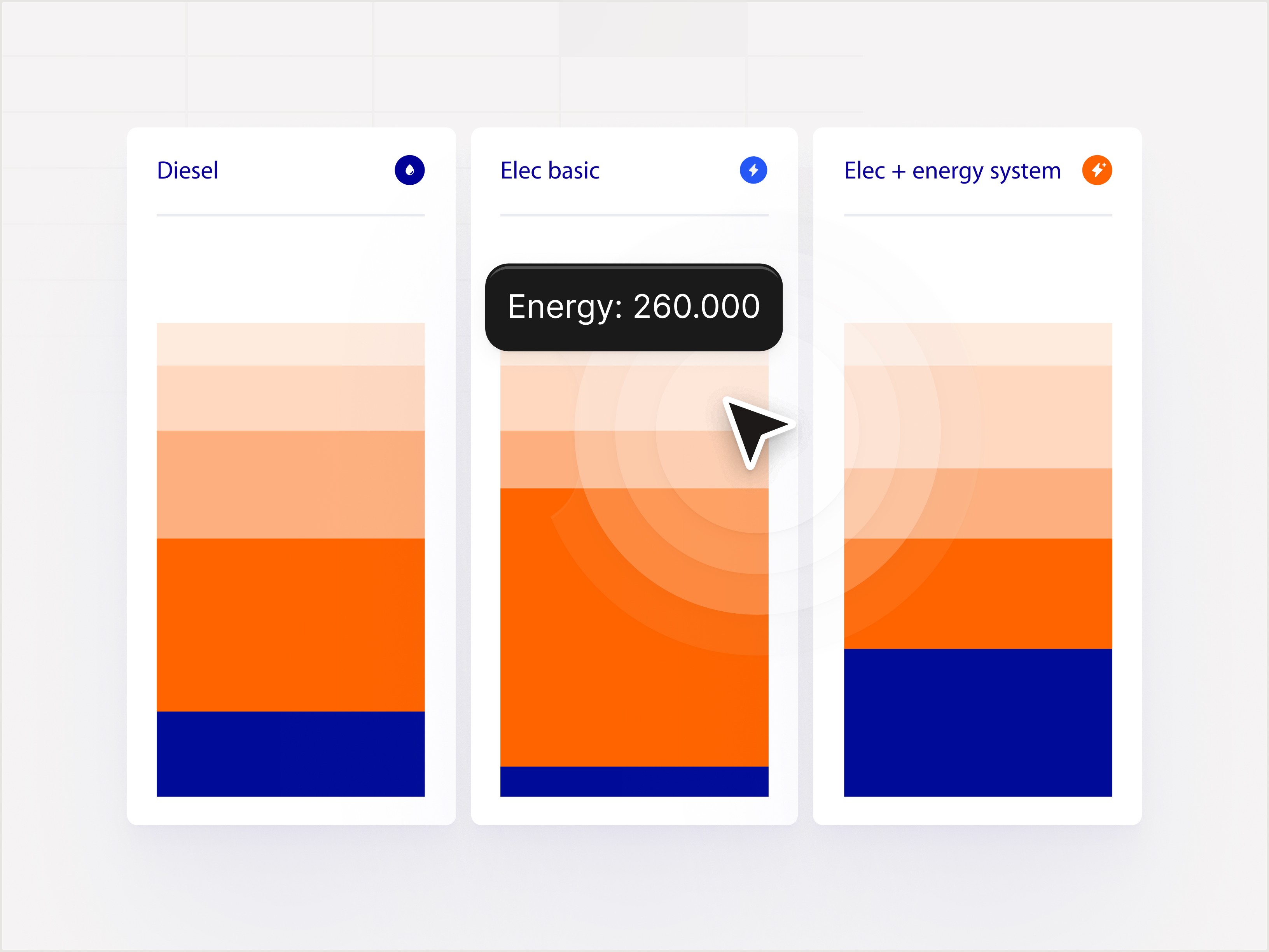
Color Zones
Usage: Utilize color-coded zones to represent different data ranges.
Example: In a budget planner, green indicates low expenses, yellow indicates moderate expenses, and red indicates high expenses.
Benefit: Quickly communicates good, average, and poor performance areas.
Sharing your Interactive Content
Once you've created your interactive content, whether it's a retirement calculator, a menu, or a quoting tool, create a QR code and share it in our social media, print marketing, email campaigns, blogs, and advertising.
In Conclusion
There are plenty of other ways to incorporate Interactive content into your marketing plan. You can use it in your Advertising to drive results, or in your blog posts to make them super engaging.
If you're not using interactive visuals in your calculators, you're missing out big time. Interactive charts and graphs turn static data into engaging, actionable insights, boosting user engagement, satisfaction, and conversions.
Don't leave conversions on the table. Start using interactive visuals and watch your engagement soar.
Ready to transform your calculators? Get started with ConvertCalculator now and see the difference!
Let's face it plain old text can get kinda boring as bat doo doo when you're trying to make an impression…
Data displayed by your calculators doesn't have to be boring. There are plenty of ways to make it pop so it's engaging and highlights the important bits.
People use your forms and calculators to get information. How you display that information can make or break your form's success.
Think about displaying results as interactive visuals, such as graphs, charts, or dynamic elements, and transforming your boring form into a dynamic dopamine dispenser.
Turning static data into an easier-to-understand visual is as easy as adding a chart element to your form—and yep, that's pretty easy.
So let's talk about what Interactive Visuals are, the best ways to incorporate them, and have a look at some examples…
Why use Interactive Visuals?
When users can see their results as a graph or chart in real time, they interact with the content and gain clearer insights faster. And that's great for you.
Here are some good reasons to use Interactive Visuals:
Better Understanding
Visuals help users comprehend complex data more easily.
Transforming numbers and abstract concepts into visuals like charts, graphs, and infographics helps users quickly grasp trends, patterns, and outliers.
Visual simplification is great for users who may not have a strong background in data analysis. It makes it easier for them to understand and act on the information presented.
Increased Engagement
Interactive elements encourage users to spend more time on your calculator.
When users can manipulate data inputs and see instant visual changes, they are more likely to explore different scenarios and outcomes.
Hands-on interaction makes the experience more engaging and increases the likelihood of users returning to use the tool multiple times.
Enhanced engagement leads to higher user satisfaction and loyalty.
Faster Decision Making
Real-time feedback allows users to make more informed decisions based on visual data representations.
As users adjust variables and see immediate updates to graphs and charts, they can quickly evaluate the impact of their choices.
Instant feedback loops reduce the time needed to analyze data and make decisions, empowering users to act confidently and promptly.
For instance, a financial calculator that updates projections in real-time can help users swiftly choose the best investment option without extensive manual calculations.
Examples
Here are a couple of examples of how you can show, not tell, using images.
iAv2yPwxmbx9wbgpP
Interactive Visuals: A dynamic savings projection chart that adjusts based on user inputs such as current age, retirement age, current savings, monthly contributions, and expected annual return rate.
The chart visually shows how the savings will grow over time, highlighting key milestones and projected retirement income.
FBAkmw8AcKarLedpc
Interactive Visuals: An amortization schedule visual that shows a breakdown of each payment over the loan term, highlighting the portions of each payment that go towards principal and interest.
As users input different loan amounts, interest rates, and loan terms, the schedule updates dynamically to reflect the new amortization details.
Best Practices
To make your calculators more engaging with interactive visuals, consider the following:
Visualization Options: Choose the right chart types (e.g., line, bar, pie) to best represent different data sets (see below).
User Customization: Allow users to customize the visual displays, such as choosing which data to visualize.
Comparative Analysis: Enable users to compare multiple data sets side by side for better decision-making.
Tooltips and Annotations: Provide additional context by adding tooltips or annotations to key data points on the charts.
Export Options: Allow users to export the visual data as images or PDFs for easy sharing and offline use.
Using these features, you can improve user experience and make your calculators more engaging, informative, and valuable.
Best Interactive Visuals for Your Data
When it comes to displaying data, one size does not fit all. Let's look at the various ways you can present data to suit different user needs.
Types of Charts and Graphs
Bar Charts
Usage: Ideal for comparing discrete categories.
Example: Comparing monthly expenses across different categories like rent, groceries, and entertainment.
Benefit: Provides a clear visual distinction between different data points.
Line Graphs
Usage: Perfect for showing trends over time.
Example: Displaying the growth of savings over several years.
Benefit: Helps users see how values change over a period.
Pie Charts
Usage: Best for showing parts of a whole.
Example: Breaking down the percentage of your budget allocated to various expenses.
Benefit: Easily demonstrates the proportion of each category within the total budget.
Stacked Bar Charts
Usage: Useful for showing the composition of different categories in relation to the whole.
Example: Visualizing the cost allocation for different components of a wedding budget.
Benefit: Highlights the contribution of each category to the total.
Nxot6u4TeM6JGZa8C
How to improve experience with Visuals
Here are 4 ways to use visual imagery in your calculators.
Images
Usage: Show data with an image instead of text.
Example: In a T-shirt cost calculator, use detailed images to show different T-shirt styles and color options. For instance, include high-quality images of various T-shirt styles such as V-neck, crew neck, and long sleeve. Additionally, use images to display the available color options, allowing users to see exactly how each style looks in different colors.
Benefit: Draws user attention to important information. Larger images of T-shirt styles and colors help users make more informed decisions by providing a clear visual representation of their options, enhancing the overall user experience and satisfaction.
Example: This t-shirt pricing calculator uses Visuals to display color options.
3m7sQ4BAWQ97MvbxQ
Larger Images
Usage: Highlight significant data points with larger, more detailed images.
Example: Use a detailed image to display a comprehensive sales performance chart for the quarter. The image could include a line graph showing monthly sales trends, a bar chart comparing product categories, and a pie chart illustrating market share.
Benefit: Draws user attention to important information.
Icons
Usage: Use icons to represent different data categories.
Example: Using house icons for housing expenses, car icons for transportation, etc.
Benefit: Simplifies understanding by using visual cues.
Example: This Met Calc uses Icons to emphasize important data.
EYLZeB6wuLquHvN2x
Color Zones
Usage: Utilize color-coded zones to represent different data ranges.
Example: In a budget planner, green indicates low expenses, yellow indicates moderate expenses, and red indicates high expenses.
Benefit: Quickly communicates good, average, and poor performance areas.
Sharing your Interactive Content
Once you've created your interactive content, whether it's a retirement calculator, a menu, or a quoting tool, create a QR code and share it in our social media, print marketing, email campaigns, blogs, and advertising.
In Conclusion
There are plenty of other ways to incorporate Interactive content into your marketing plan. You can use it in your Advertising to drive results, or in your blog posts to make them super engaging.
If you're not using interactive visuals in your calculators, you're missing out big time. Interactive charts and graphs turn static data into engaging, actionable insights, boosting user engagement, satisfaction, and conversions.
Don't leave conversions on the table. Start using interactive visuals and watch your engagement soar.
Ready to transform your calculators? Get started with ConvertCalculator now and see the difference!
Continue reading


More leads in less time_
Start building the future of your company, today
Create powerful on brand calculators, lead generation forms and apps that automate your marketing and sales processes
Start with a template
Find inspiration or customize an outstanding template, complete with functional formulas and flows to help you get started.
Let us build for you
We can build your calculator, and afterwards you can always make changes yourself. Our service starts at just $250.